Feng Shui Consultant
Website + Branding
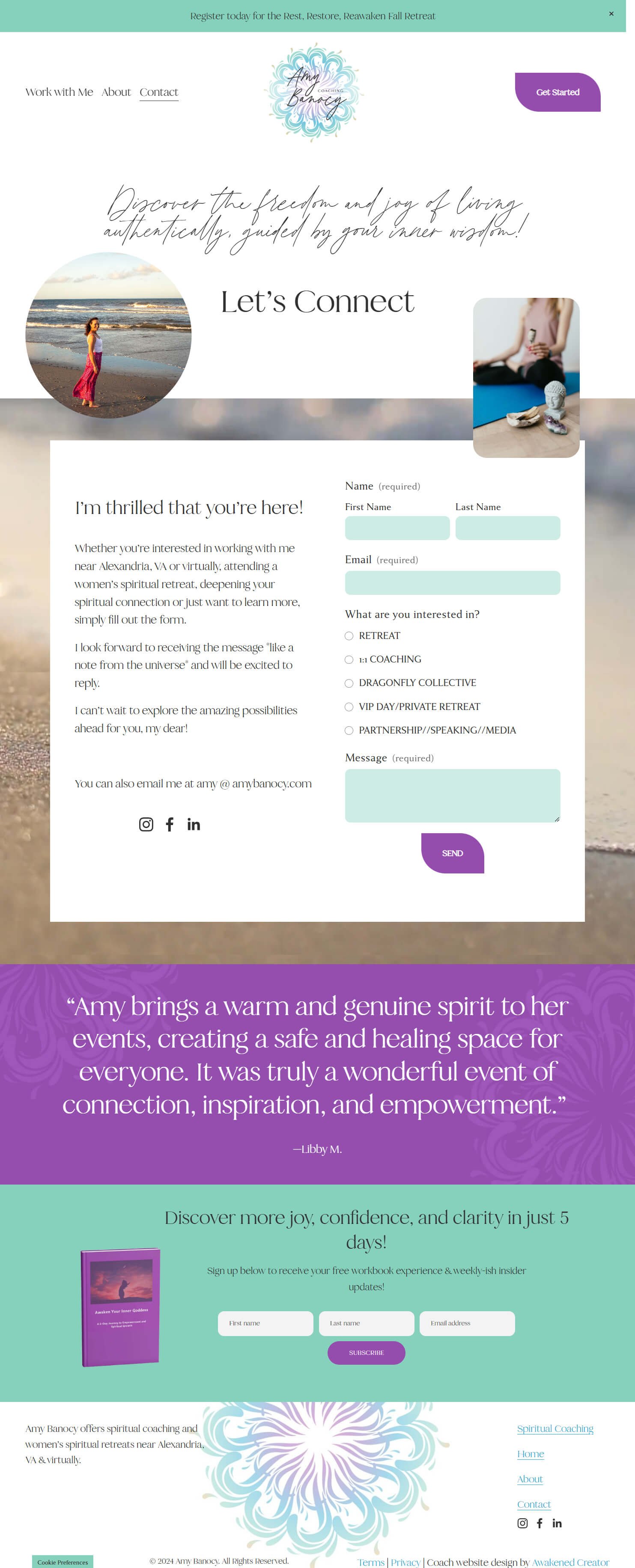
Website design + branding + ecommerce for Feng Shui practitioner & spiritual coach
Gwynne Warner-Donavon
Certified Feng Shui Mentor, Ceremonialist, & Space Healer
Gwynne Warner-Donavon is a heart-centered Feng Shui mentor and ceremonialist dedicated to helping others create harmonious, high-vibration spaces that support both inner and outer peace. With over 36 years of immersion in Asian mystical traditions, Gwynne brings a wealth of experience in sacred ceremony, meditation, Taoist practices, and Black Sect Esoteric Feng Shui to her work.
As the visionary behind 10,000 Blessings Feng Shui, Gwynne offers bespoke services that transform living, working, and sacred spaces into sanctuaries aligned with the natural flow of energy. Drawing on the teachings of esteemed masters like Grandmaster Lin Yun and His Holiness the Dalai Lama, Gwynne works with the energies of the Five Elements, Yin & Yang, and celestial cycles to help clients create environments that nurture their deepest intentions and invite good fortune.
With a deep devotion to supporting clients in manifesting their highest potential, Gwynne’s approach is both compassionate and empowering. Her work offers a gentle yet powerful invitation to consciously craft spaces and lifestyles that resonate with beauty, peace, and abundance. Whether through virtual consultations or in-person guidance, Gwynne’s mission is to ensure that every person she works with feels energetically refreshed, inspired, and deeply held on their journey of transformation.
Project Highlights
Project Goals
After many years of a varied career as a Feng Shui consultant and spiritual practitioner, Gwynne was ready to pull all her offerings under one roof and expand her business further by opening an e-commerce store.
She was ready for a website that:
fully reflected the principles of Feng Shui and the essence of her own unique soul
provided business expansion
made all her offers clear and easy to book
The “before”
When we started working together, Gwynne was craving a website designer that could become a true partner after coming from a horrible previous experience. Her website was outdated and didn’t give prospective clients a sense of the beauty or power of Feng Shui or the transformation that it can bring to your life or space.
Colors & Fonts
During our initial call, we both tuned into Amy’s business energetically and intuitively, and the vision became clear.
Vibrant colors reminiscent of the sea and sunset evoke the quiet strength and calm of Amy’s earned wisdom, bright light, and work supporting others.
The font duo of Harlow Script and Serif designed by Mila Garrett mirrors the flow of emotions and the ocean that Amy adores with the script while lending a solidity to the growth process with the serif, both also reflecting Amy’s grounded vibrancy.
Logo and Visuals
For the primary logo, I created a wave mandala to evoke the expansiveness and flow of the tide and foster a sense of light in the darkness, just as allowing emotions to move through helps Amy’s clients tune into their own light, even in the darkest times. It also evokes her own soul’s bright light and speaks to the nature of her spiritual work and the timelessness of the wisdom.
The brand mark is a brighter version of the wave mandala and can be used on its own, or in any of the brand colors, to accent her site and marketing materials.
Primary Logo
Brand Mark
The brand personality that arose from the initial visioning call was welcoming, safe, connected, and in-flow, which I used as the underpinning for all the visuals, layout, and site flow, in addition to the logo, colors, and font.
Using her color scheme and brand mark in various colors, I augmented the visual interest of her site through curated stock photos and videos of the ocean shore and waves, and created overlays of alcohol ink on sand images. The result is a cohesive blend of sea and sky, evoking the expansive flow that Amy creates through her work with clients
The Website
After moving through the Intuition and Illumination phases of the project, the vision was clear, and I pulled it all together, along with copy generated by Amy, in a cohesive, optimized website that helps Amy stand out and encourages her right-fit clients to reach out through a smooth client journey.
The completed website comprised of 3 main elements:
Core pages: Home, About, Work with Me, & Contact
Lead magnet opt-in integration with Flodesk
Easy scheduling and purchasing through integrating Calendly


Results
After our work together, Amy felt excited to work in her business and share her offerings on a larger scale than ever before now that she had a brand and website that fully reflected the essence of her business and her soul.
Here are some of the project highlights:
In her own words…
“Before working with Angela, I felt frustrated and embarrassed about my WordPress site. It was a headache to make changes, and it didn’t reflect who I truly am, which made me hesitant to share it with others. I had tried creating my own site elsewhere but just couldn’t get it right.
What I needed was the assurance that Angela would craft a website that genuinely embodied my essence and was user-friendly for my clients. I realized that not having my site up to date was costing me potential income, which motivated me to invest in her services. I had to remind myself that I was worth this investment in myself and my business.
After collaborating with Angela, I felt a renewed excitement to share my website with everyone. I felt cared for throughout the process and was finally ready to promote my offerings. The transformation has been profound: I’ve received compliments on my site, I feel more confident in sharing my business, and I’m genuinely proud of what we created together—it truly feels like me!
The highlight of the experience was our first call, where we engaged in meditations that set the tone for our work. Honestly, there’s nothing I would have changed about the process.
I wholeheartedly recommend Awakened Creator design services to anyone looking for a website that reflects their heart-centered mission. I’ve already shared this recommendation with others because I truly believe in the power of Angela’s work.”
Your business deserves a soul-aligned website, too!
Share your work with pride and stay in your zone of genius with professional brand and website design that supports you every step of the way.


